How to customise your monday.com boards: ten top tips
Share on socials
How to customise your monday.com boards: ten top tips
Jump to Section
Jump to section
Getting started
1. Add some colour to your groups
2. Don't stop there; add some to your labels too!
3. Use 'Dark' and ‘Night’ mode to give your eyes a rest
4. Use conditional colouring to add emphasis to your data
5. Make sense of your board by renaming your items
6. Use Unlimited Subitems to level-up your task organisation
7. Resize your columns and items
8. Tidy up your board by reorganising columns and groups
9. Hide, collapse and expand your columns
10. Use summary tools to review your data
Spruce up your board designs with our monday.com apps!
Resize, reorganise, reimagine! Add some colour to your monday.com workflows by following these top tips on custom-designing your monday.com boards.
Welcome friends, and happy Monday!
We're back with another hints and tips blog to read over your Monday morning coffee.
Say goodbye to the Monday blues and hello to seamless, customised monday.com board designs by following these top tips to add some colour and fun to your monday.com workflows!
We're back with another hints and tips blog to read over your Monday morning coffee.
Say goodbye to the Monday blues and hello to seamless, customised monday.com board designs by following these top tips to add some colour and fun to your monday.com workflows!
Getting started
At this point, monday.com needs no introduction - it's the world's leading Work Operating System!
One of our favourite things we've found using it here at Upscale is discovering its many customisable features.
Whether you've boards set up to keep track of weekly to-dos for your team synchs or to manage ongoing projects and plans, monday.com doesn't employ a 'one size fits all' approach - far from it! Its boards are fully customisable to meet your specific team and individual needs.
However, with so many features available, it can be difficult to know where to start.
If you're new to monday.com boards, we definitely recommend checking out our previous blog, Tips for getting started with monday.com boards.
Once you've got to grips with the basics, you can start exploring all the different features available and choose which ones you'd like to incorporate into your monday.com board designs.
Without further ado, let's take a look at our top tips to help get the ball rolling.
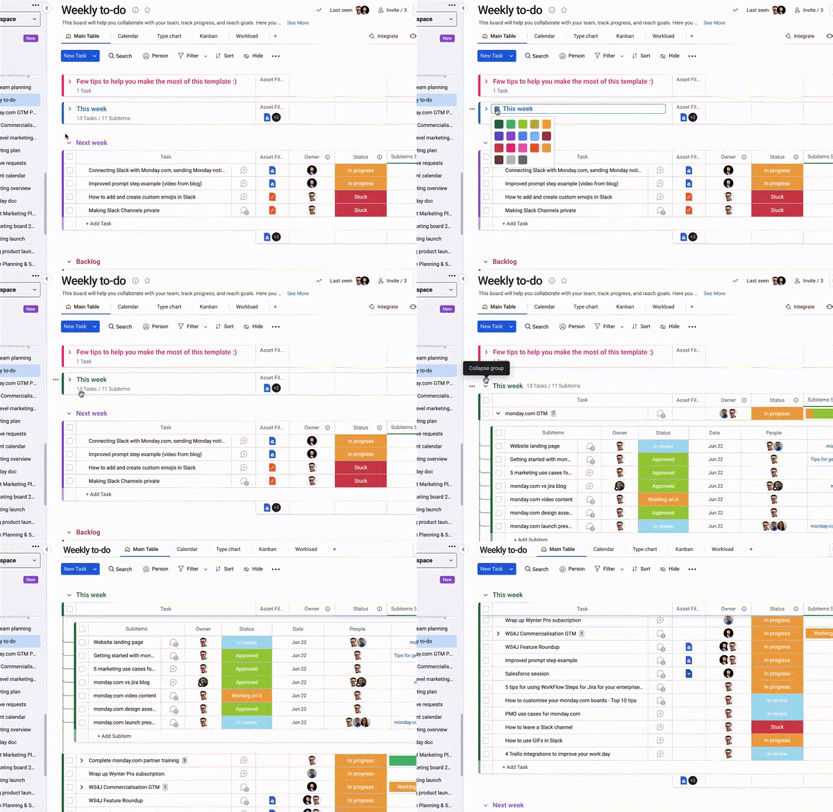
1. Add some colour to your groups
While monday.com will apply default colours to your boards once they've been created, you don't have to settle for those. Perhaps you'd like to colour code your boards based on month, team, tasks etc., or maybe you just want to make your boards a bit more personal by incorporating your favourite colours and seeing which ones work well together?
By changing the group's colour scheme, your chosen colour will appear in the group's name, the timeline column, and next to each item in the group.
There are several colours to choose from, so start exploring and building them into your monday.com board designs today! It's fun and will really brighten up your monday.com board designs, while also making it easier to distinguish between your different boards at a glance.
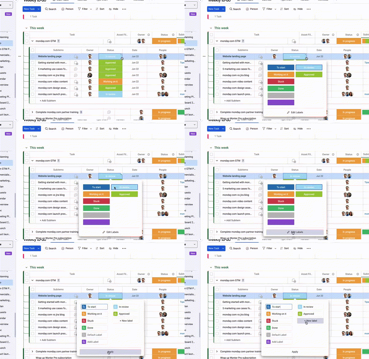
2. Don't stop there; add some to your labels too!
Take your colour creativity to the next level by choosing from 40+ colour options to add to your monday.com labels (used in the status column).
I've found these useful when looking to easily show what stage a piece of content is in. For example, 'red' can show if an item you're working on has stalled, yellow to show it is 'in progress', lime green to show if it's 'in review' and green to show when it's in our favourite place, 'Done'.
Depending on what you've named your labels and what you intend to use them for, you can choose the colour scheme that best suits your specific needs - so don't be afraid to go wild!
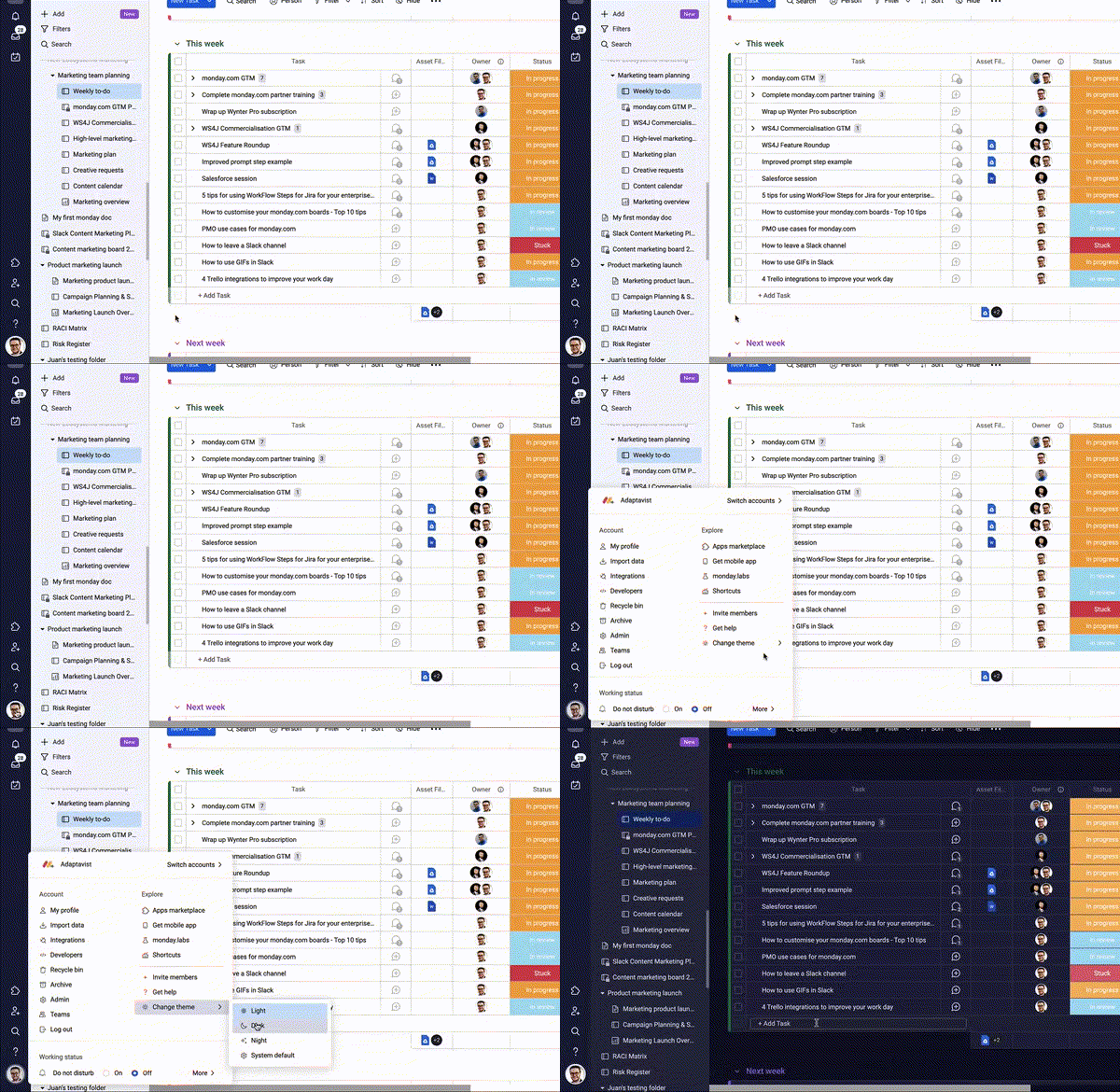
3. Use 'Dark' and ‘Night’ mode to give your eyes a rest
We've all been there. Hours on end spent staring at a screen, to the point where words and numbers all seem to mesh into one, and your head starts to ache!
monday.com has you covered.
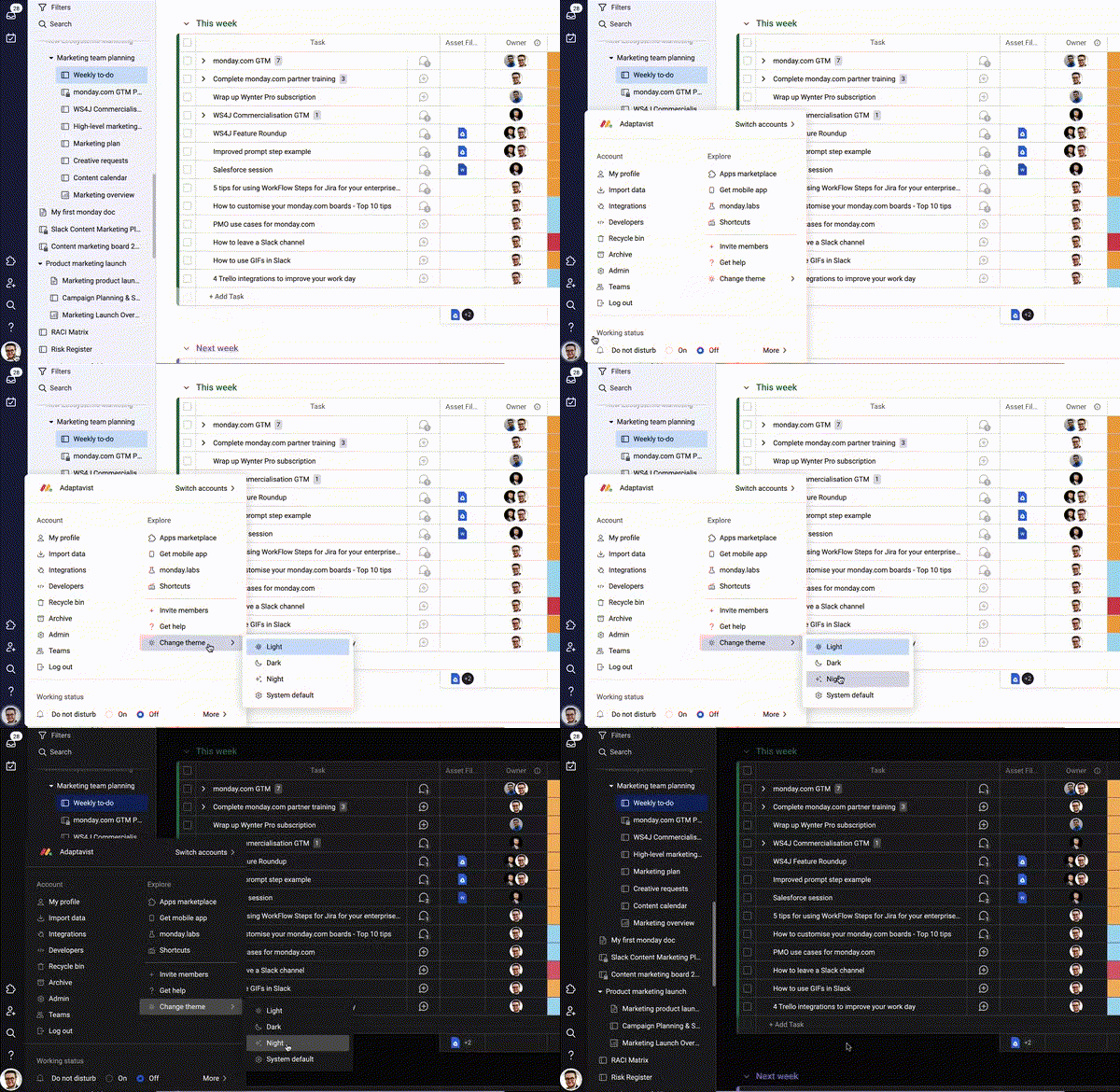
Use Dark mode to change the display of either your entire account or just your views and dashboards to a dark display colour palette. Your text, icons and graphics will use a light-coloured scheme set against a dark blue background. This will give your board a cool, sleek look and make viewing your board a little easier on the eyes.
Go even darker with 'Night' mode
Looking for an even darker backdrop, with more of a contrast between the colours on your screen and the background?
We recommend using Night mode.
Similar to Dark mode but employing a much darker background colour palette, Night mode is an excellent feature for working comfortably in low-light environments and will really make the vibrant colours you've used for your groups and columns pop off the screen!
Use Dark and Night modes to make working in front of a screen less of a strain. Your eyes will thank you.
4. Use conditional colouring to add emphasis to your data
Remember conditional formatting in Excel, folks? Well monday.com takes that feature to the next level.
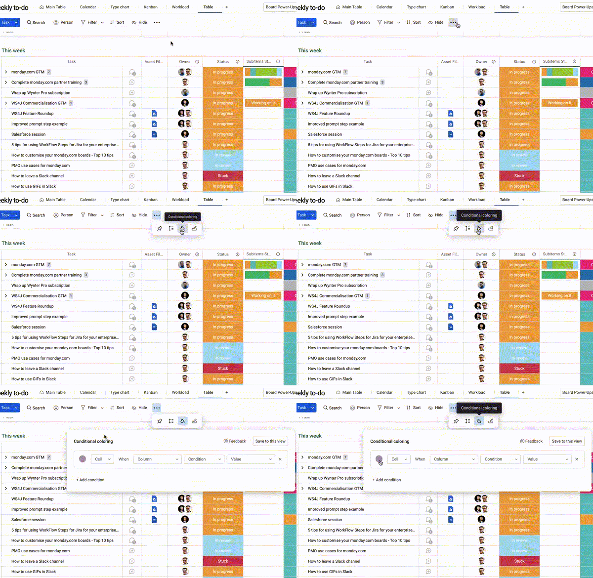
Keeping with the colouring theme, use conditional colouring to apply colours to cells that match your specified criteria. This will help you to easily separate the information on your board or add visual emphasis to your data.
Keeping with the colouring theme, use conditional colouring to apply colours to cells that match your specified criteria. This will help you to easily separate the information on your board or add visual emphasis to your data.
3 example uses for monday.com conditional colouring
- Set the colour to green where an appointment is due to take place today; all appointments with the due date today will now appear in green.
- Set colour to purple for all meetings that are due to go over 60mins; all meetings scheduled to go more than 60mins will now appear in purple.
- Set colour to orange to show all items assigned to specific team members. Any items assigned to x or y team members will appear in orange.
5. Make sense of your board by renaming your items
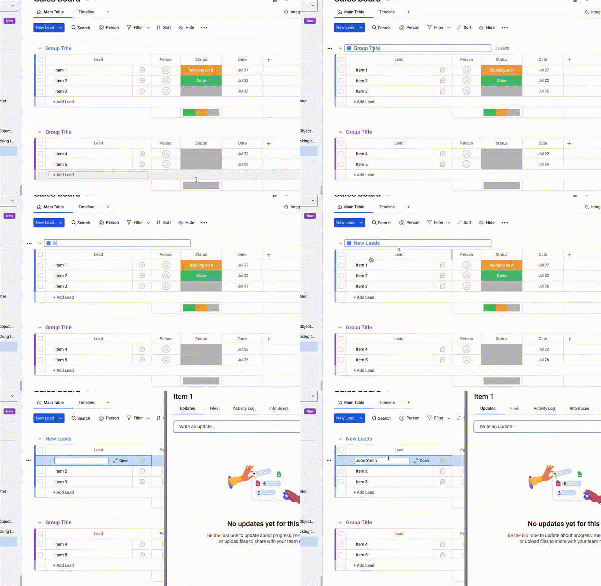
Item 1, Item 2, Item 3, Item 4 etc. These are the first things you'll see when creating a monday.com board from scratch.
Not only are they not very imaginative, but they're not very useful either (I'm not sure letting my manager know I'm working on Item 3 this week would make much sense in our weekly synchs).
It's because monday.com wants you to customise them, and start incorporating your own terminology into your workflows.
For example, if you're a sales team and using your monday.com board to keep track of new leads, you can customise your items so that the rows on your boards will no longer appear as 'Items', they'll instead appear as 'Leads'.
This is a great way to embed the language you and your teams use to communicate every day into your monday.com workflows.
6. Use Unlimited Subitems to level-up your task organisation
Staying with the example we've used in tip number 5, you've successfully renamed your items to reflect your individual sales leads - congrats! What were formerly 'Item 1', 'Item 2' and ‘Item 3' on your board, are now displayed as ‘John Smith', 'Mary Wilson' and 'David Johnson'.
But how are you going to reflect your follow-up activities for each lead?
Adding each task as a subitem is one option. However, does that allow you to go deep enough into the detail? Does it really provide an accurate reflection of your work? Do you find your boards becoming messier with each new subitem you add?
If you're grappling with these questions, we recommend using Unlimited Subitems.
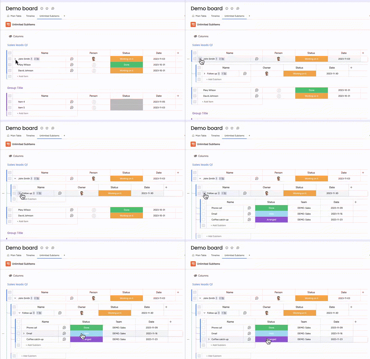
With Unlimited Subitems, you can break down your tasks into smaller, more manageable subitems that can easily be expanded and collapsed, allowing you to maintain your board's tidiness while still being able to reflect your individual tasks.
So, you might have 'John Smith' as the parent, top-level item, 'Follow up' as the parent subitem, then 'Phone call', ‘email', ‘coffee catch-up’ etc. broken down into individual sub-tasks using Unlimited Subitems. You can manage, track and update the status and progress for each one - it really is that simple!
7. Resize your columns and items
Customise the width of your board columns by simply clicking and dragging your columns to resize them precisely as you like. A handy feature for highlighting columns that contain important information or a lot of text.
Similarly, if you have an item with a longer name and you don't want the text to be cut off, you can resize it to display more information. Choose between single, double, or triple item height!
Similarly, if you have an item with a longer name and you don't want the text to be cut off, you can resize it to display more information. Choose between single, double, or triple item height!
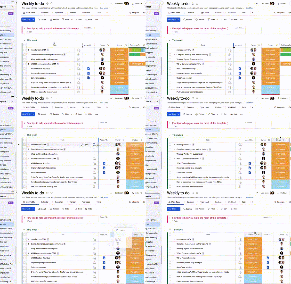
8. Tidy up your board by reorganising columns and groups
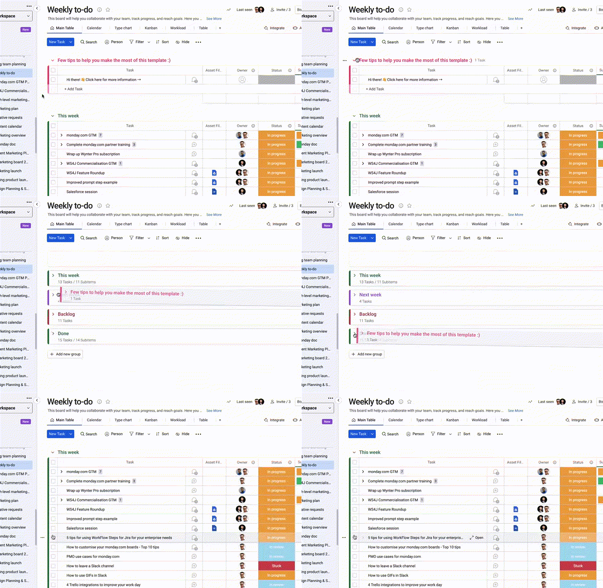
When adding new columns or groups to your monday.com board, they will first appear at the far right or bottom of your board. As you continue to add more columns and groups to your board, leaving them in their automated starting place can lead to things getting a little, messy.
Luckily, it's easy to reorganise your board's columns and groups. Simply use the drag and drop function to move your columns and groups around the board so that they appear in whatever order works best for you! Whether that's chronologically, in order of relevance, or priority - it's easy to keep your board neat and tidy with this monday.com tip.
9. Hide, collapse and expand your columns
Another way to keep your workspaces from feeling too cluttered is to use the 'Hide' feature to keep selected columns hidden from your board view.
This is a handy feature to use if there is important information you want to keep in your workspace but don't necessarily need to see there all the time.
And, like the other cool features we've looked at here, it's super easy to use!
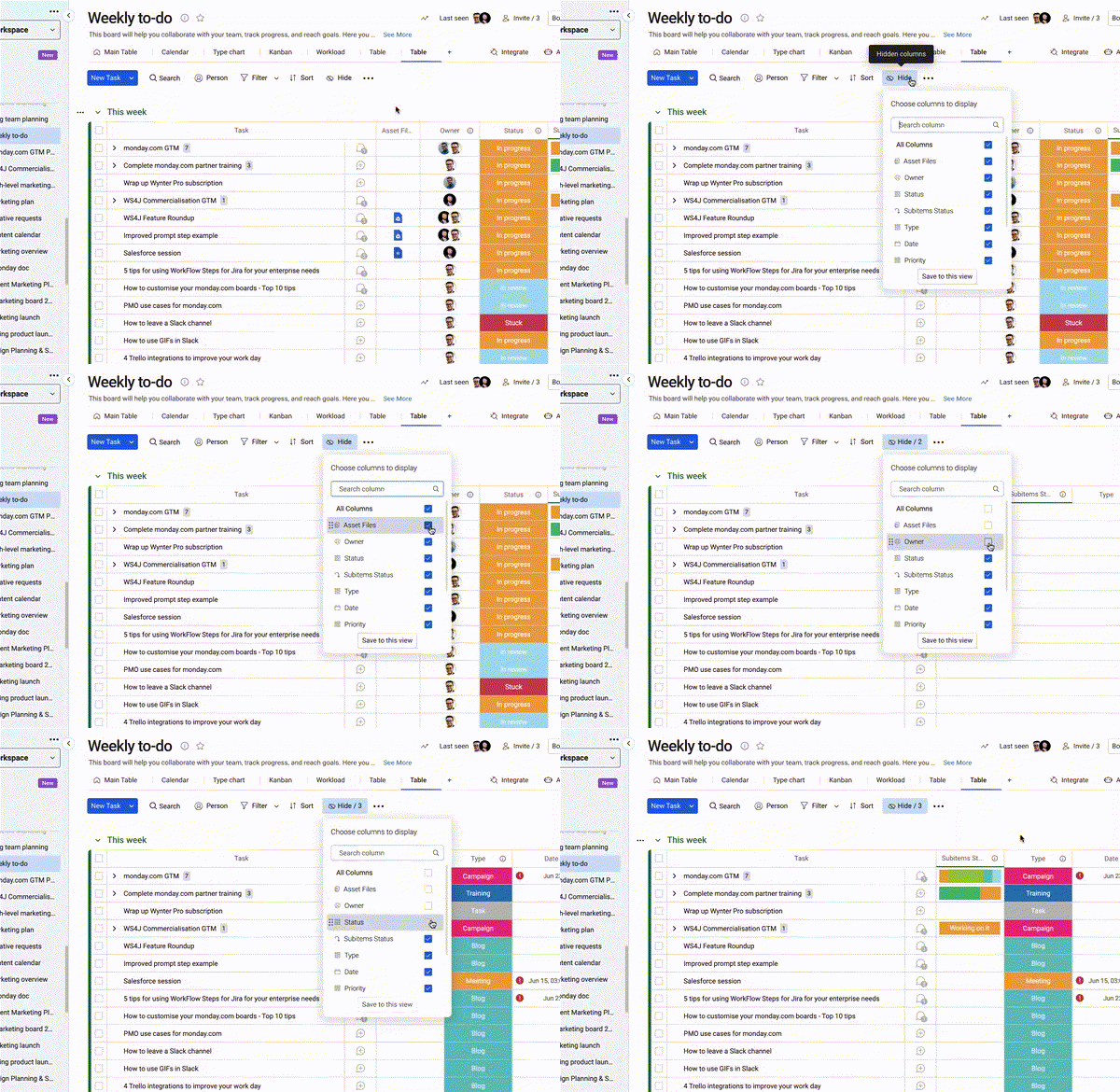
- Open any of your boards and click on the 'Hidden Columns' icon at the top of your board.
- This will automatically select all of your columns, meaning they are currently displayed on your board.
- Select the ones you do not want to appear on your board to hide columns.
- Alternatively, you can deselect 'All Columns' and choose the columns you want to display.
You should now see only the columns you have selected to remain visible, keeping column clutter itself - hidden.
Use collapse and expand if you want to quickly refer back to column information without keeping it completely hidden. This will keep your board looking tidy while allowing the column to remain a part of your main board view.
10. Use summary tools to review your data
The more you continue to add data to your board, the more you'll need a way to quickly view that data at a glance. There are a couple of different ways you can do this.
Column Summary
Column summaries can be added to any of the columns on your boards.
You may need to see a quick overview of how many new leads have been contacted, total revenue over the last month, or how many pieces of content are stuck in review, for example.
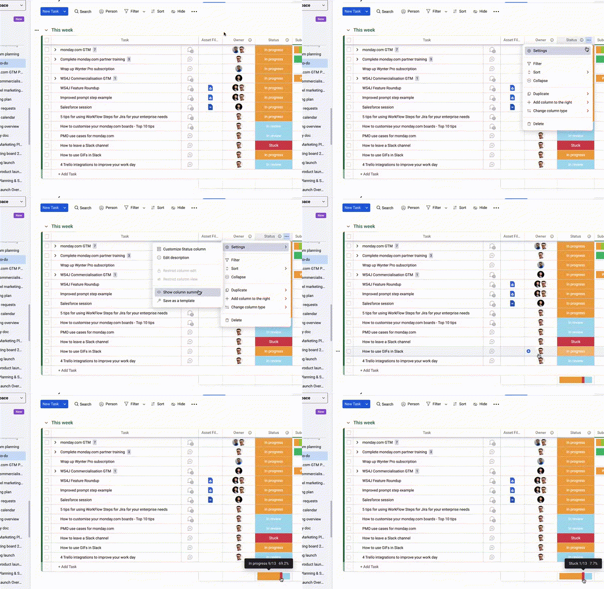
To do this, simply click on the 'Show Column Summary’ option from the column settings to get a quick numerical overview of your column data.
To do this, simply click on the 'Show Column Summary’ option from the column settings to get a quick numerical overview of your column data.
Group and board footer
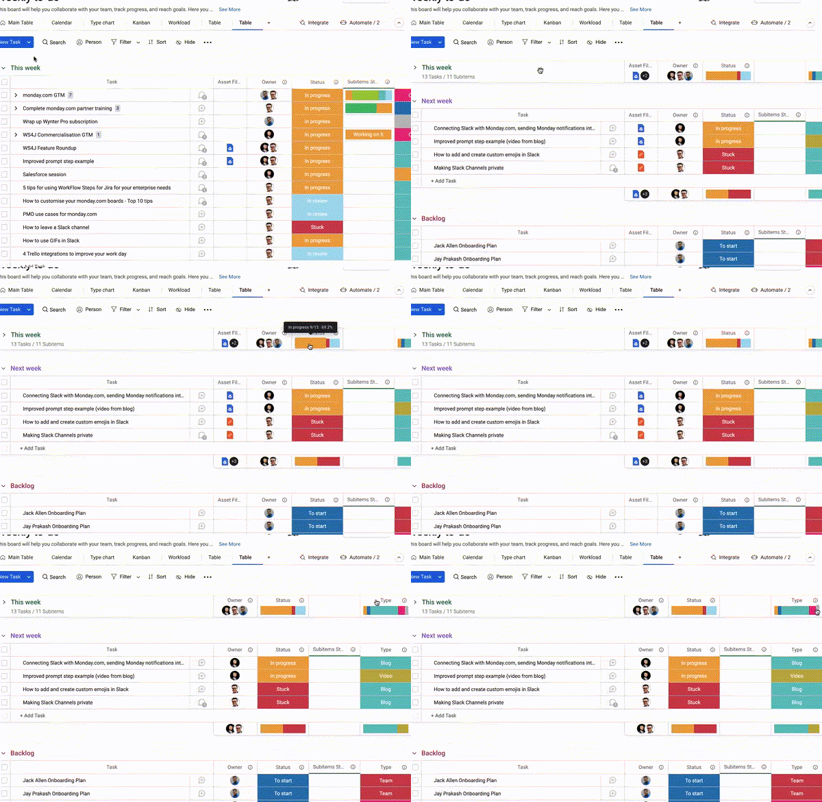
Look at the bottom of your board once you've collapsed your groups for an even higher-level overview of all the columns with column summaries.
There you'll find a footer showing overviews of all of the columns with column summaries, giving you a high-level overview of the collapsed data in each of your groups.
There you'll find a footer showing overviews of all of the columns with column summaries, giving you a high-level overview of the collapsed data in each of your groups.
Spruce up your board designs with our monday.com apps!
Voila! Now that you've had a glimpse at some of the many customisable features available with monday.com's workspaces, have a go at customising your own boards using some of the tips we've covered above.
Now take your monday.com board design game to the next level with our integrated apps:
Now take your monday.com board design game to the next level with our integrated apps:
- Recurring Tasks for monday.com: allows you to create any number of repetitive tasks in just one easy step. If you're looking to accurately reflect your repeating an recurring tasks in your monday.com board designs in a quicker and easier way, then Recurring Tasks in the app for you!
- Unlimited Subitems for monday.com: enables you to create as many levels of subitems as you want. If you want your monday.com board designs to get more into the details of your project management, give Unlimited Subitems a try.
- Integrate Plus for monday.com and Slack: empowers you to achieve unparalleled productivity by ensuring all your essential updates are tracked, monitored and updated in monday.com - all directly from Slack! Upscale your collaboration experience and give it a try.
Would you like some more hints and tips?
If you're still not sure where to get started or would like some more hints and tips on how to customise your monday.com boards, please feel free to get in touch, and one of our friendly Upscale colleagues will be happy to reach out to help better understand your needs, and customise your monday.com workflows around them.
Visit our monday.com hub page for all the latest news, resources and tools to help you supercharge your monday.com workflows.
And as our friends and monday.com like to say, 'Done'.
Visit our monday.com hub page for all the latest news, resources and tools to help you supercharge your monday.com workflows.
And as our friends and monday.com like to say, 'Done'.
Related Content
Read moreWritten by
monday.com
Related Content
Read more


